Exhibition | Color is Primary
August 18 - September 10, 2022
This show explores the language of color and the many ways it’s used to tell a story. Before our brain has time to process what the image is, we have an instinctual reaction to the color of a piece. Hot or cold, aggressive or passive, harmonious or discordant, color holds the key to our hearts and sets the mood. Each piece makes a statement through the artists chosen palette. Each person reacts with their own individual reading of those hues.
Ileana Appleton Foster, Hannah Berta, Gideon Bok, Jessica Lee Ives, Peggi Kroll Roberts, Susan Lichtman, Nathaniel Meyer, Colin Page, Jennifer Pochinski, Simon van der Ven, Deborah Zlotksy
View Full ShowDOMINANT COLOR
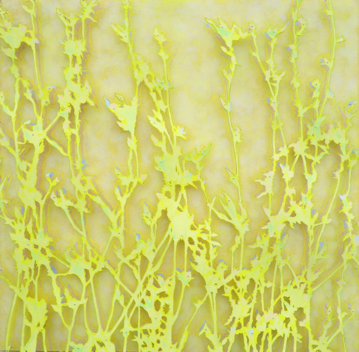
"I was for years in the yellow period, you know.” ― Josef Albers
Ileana Appleton Foster and Hannah Berta work within a small range of color in very different pieces but to a similar effect, making very similar colors feel like distant neighbors. A painting in all yellow makes any subtle shift in that hue stand out. Slightly different colors seem drastically different in the context of these pieces. They create a color world and we have to dive in to experience their art fully.
HOT AND COLD
"I think color is a close friend of the psyche, kind of a mode." - Mamma Andersson
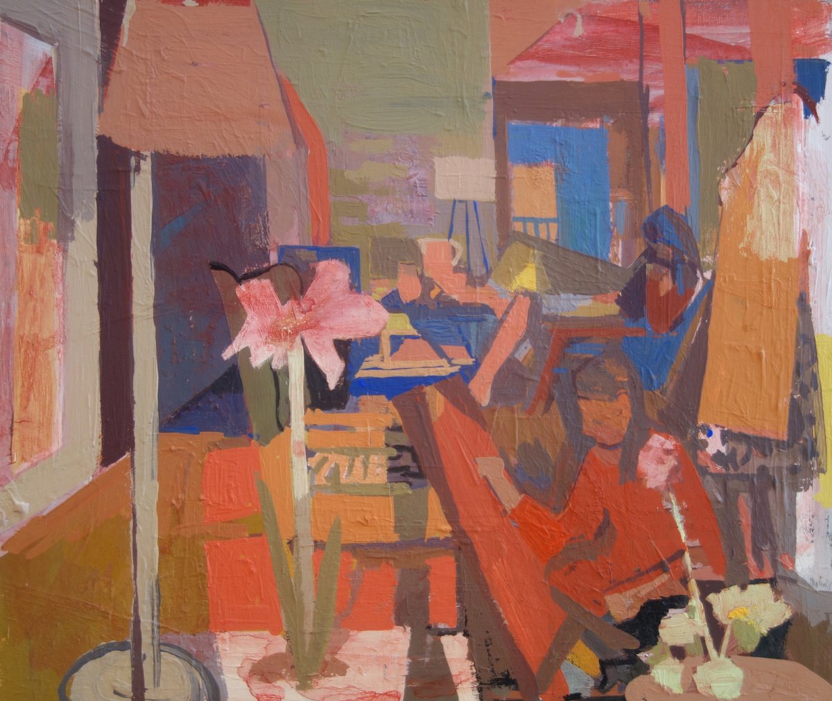
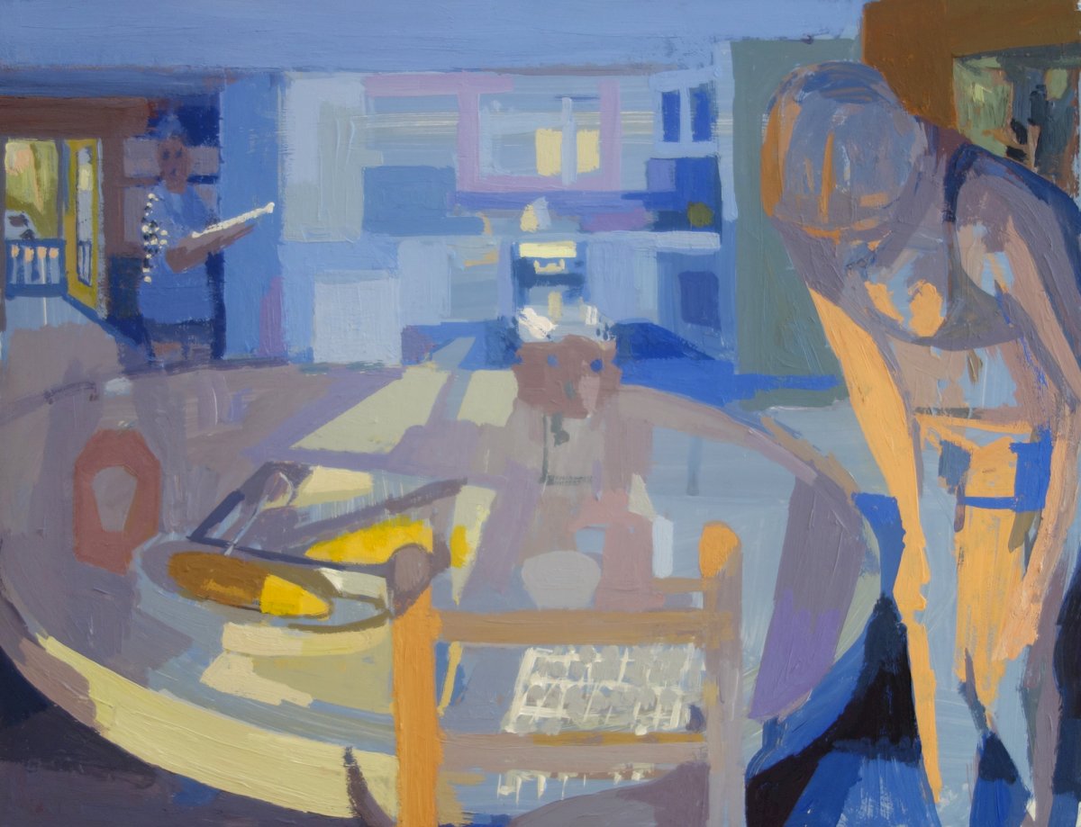
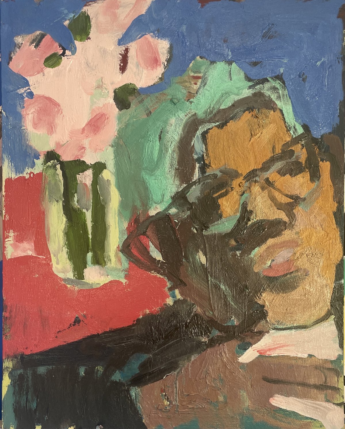
Susan Lichtman paints the same interior space with two different color ideas. In Blue Kitchen we are sitting in cool shadows, the dominant blue of the scene making the moments of direct sun all the more noteworthy. We notice a marked difference in how this painting feels when seen next to the warmth of Red Interior. Direct sun shines into this composition, but Susan chooses to direct our attention to the warm coziness of the living room and the activity therein. Simply by changing the color scheme, Susan is able to adjust how the viewer interacts with the same painted space.
COLOR RELATIONSHIPS
"With color one obtains an energy that seems to stem from witchcraft." - Matisse
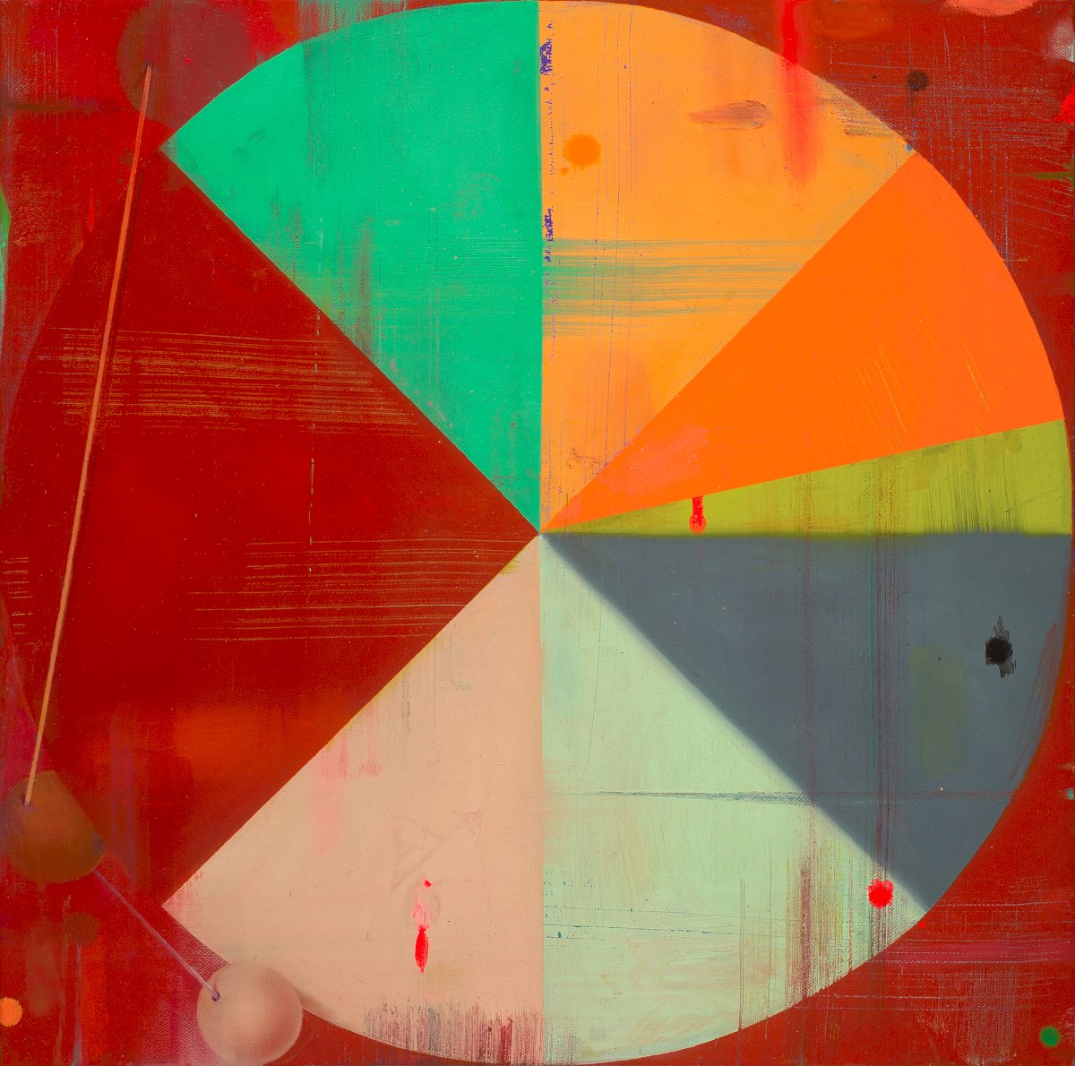
Deborah Zlotsky uses opposing colors - opposites on a color wheel - to create friction in her work. Our reaction to her painting begins with a response to the saturation of colors. Simple shapes of intense but drastically different color agitate the canvas. Her color relationships build their own energy.
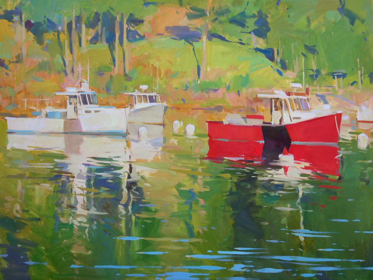
Colin Page Page paints an overwhelmingly green canvas with a red lobster boat. The red boat is made more vibrant by its green surrounding, the complimentary colors pushing against each other to make the painting dynamic.
BRIGHT COLORS, TIGHT VALUES
"Value does the work, color takes the credit" - anonymous
Jennifer Pochinski’s paintings are as much about the design of big color shapes as they are a depiction of a figure or landscape. Her paint handling is so direct, we stop focusing on the illusion of a subject and notice the beauty of color interactions: harmony, vibration, dissonance. Many bright colors are used to describe this figure with flowers, but they are calmed by keeping within a limited value range. A limited value range allows for more playful color choices.
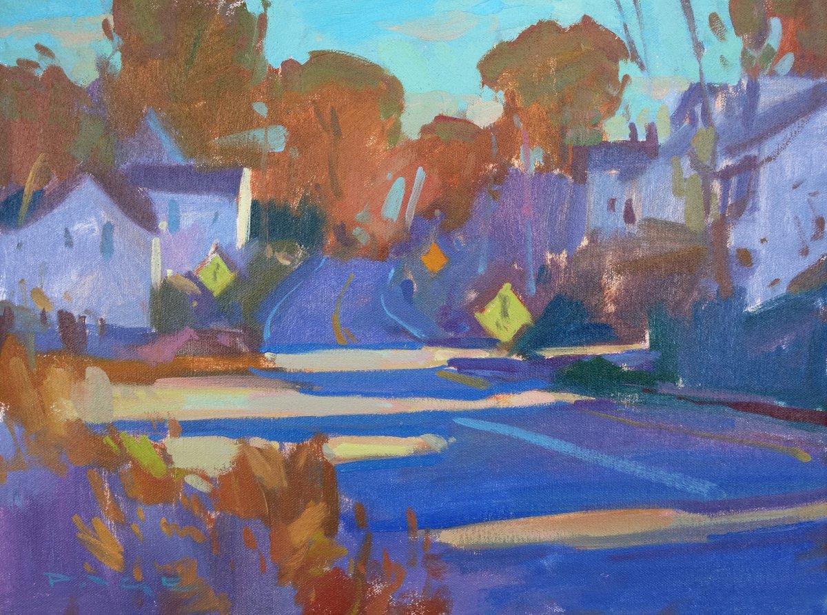
Colin Page uses the same idea to calm his intensely colorful painting, Leaving Town. Deep blue shadows are the same value (level of darkness) as the warm brown trees in the background. If seen in black and white, we would see a simple arrangement of shapes, which calms down and organizes the overall composition.
COLOR AS A FILTER
“The whole world, as we experience it visually, comes to us through the mystic realm of color.” -Hans Hofmann
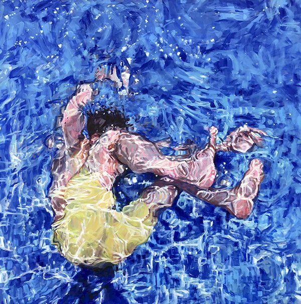
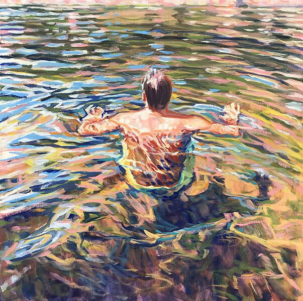
Jessica Lee Ives’s underwater paintings live in a place where the view is filtered through the color of the water. She chooses a color key to tell us about the kind of water we are swimming in, whether a bright blue pool or murky green lake water. Color key is a color scheme. It’s a specific choice meant to manipulate the viewer’s response. Every painting is a series of choices, from composition, to color, to how to best push paint around to fit the subject and idea.