Exhibition | Return to Color
May 20-June 12, 2021
Color is a language of emotion and illusion. Color is a science of interaction and perception. These artists show how color has a significance all its own.
Artists include Gideon Bok, Jessica Lee Ives, David Jacobson, Colin Page, Peggi Kroll Roberts, George Pearlman, and Deborah Zlotsky.
Color as Emotion
I think color is a close friend of the psyche, kind of a mode." - Mamma Andersson
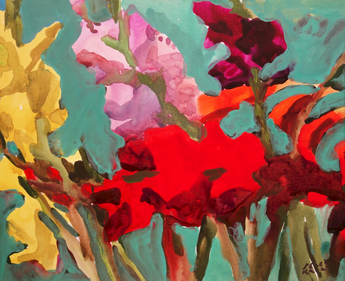
Spring is a celebration. Flowers trumpet the arrival of warm weather. Budding trees foreshadow a verdant summer. Birds chirping and frogs peeping tell us to wake up and get outside.
Peggi Kroll Roberts and Jessica Ives use color to grab our attention and share their excitement for the season. In these paintings, the differences between neighboring colors make them more powerful by their proximity. Jessica's trio of colors in the sky, blue over a wash of pink next to yellow, have a bright energy because of their color differences. Similarly, Peggi's simple shapes of red against a background of blue define a flower without detail. Red becomes more red next to its complimentary color, the flower glowing in the foreground.
Color Interactions
“In nature, light creates the color. In the picture, color creates the light.” - Hans Hofmann
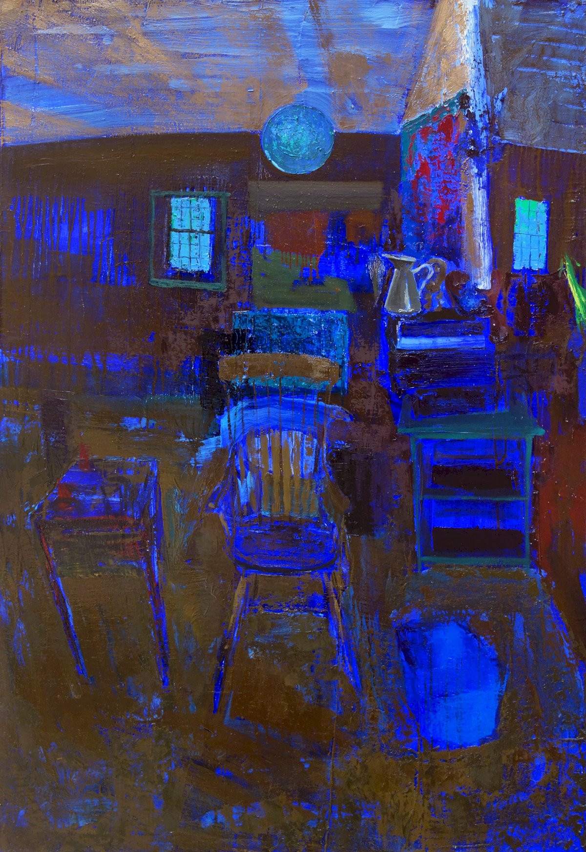
Gideon Bok and Deborah Zlotsky are both using the interaction of color temperatures to create dimension. Each uses colors with opposing temperatures but the same value of darkness to create an illusion, a vibration. In Gideon's painting, the warm black and cool blue agitate next to one another, recreating how our eyes see the glow of a dark room and giving his painting energy and form. In Deborah's painting, she is using temperature to play with our sense of space and depth, shapes of colors push against one another giving them weight and form.
Color Intention
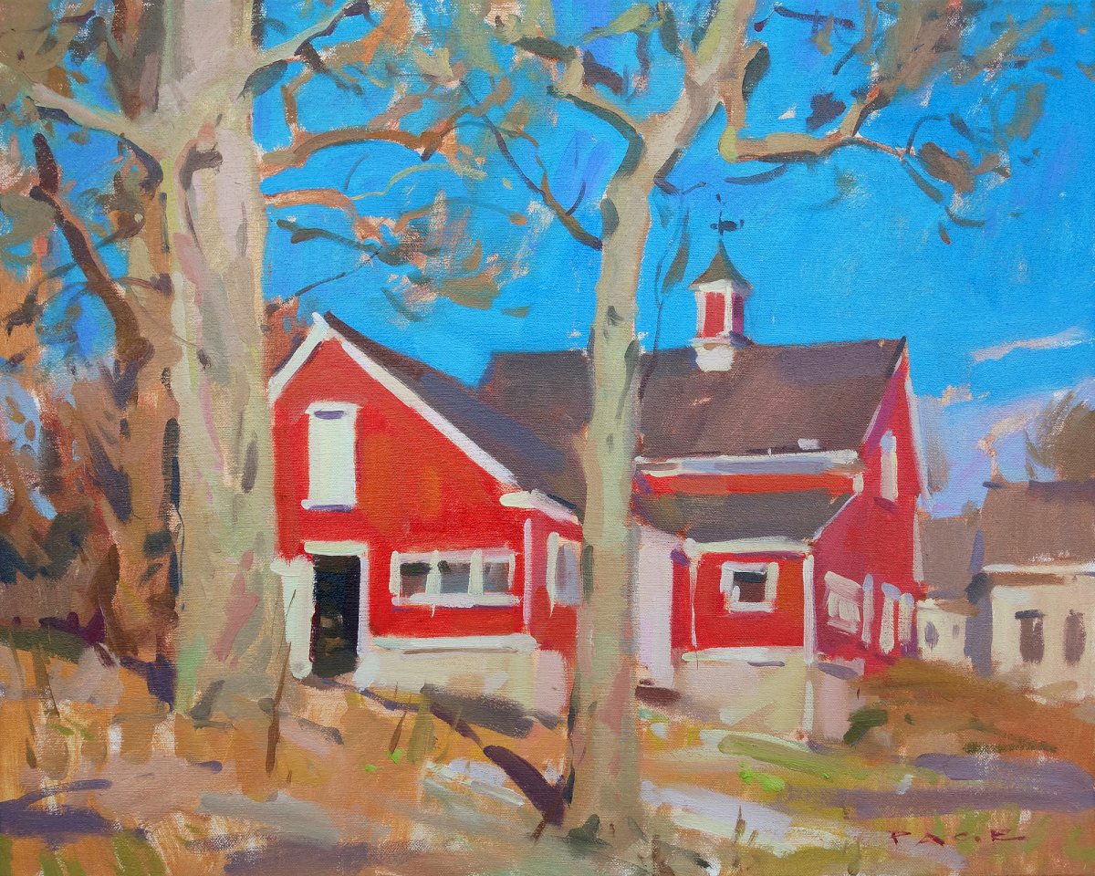
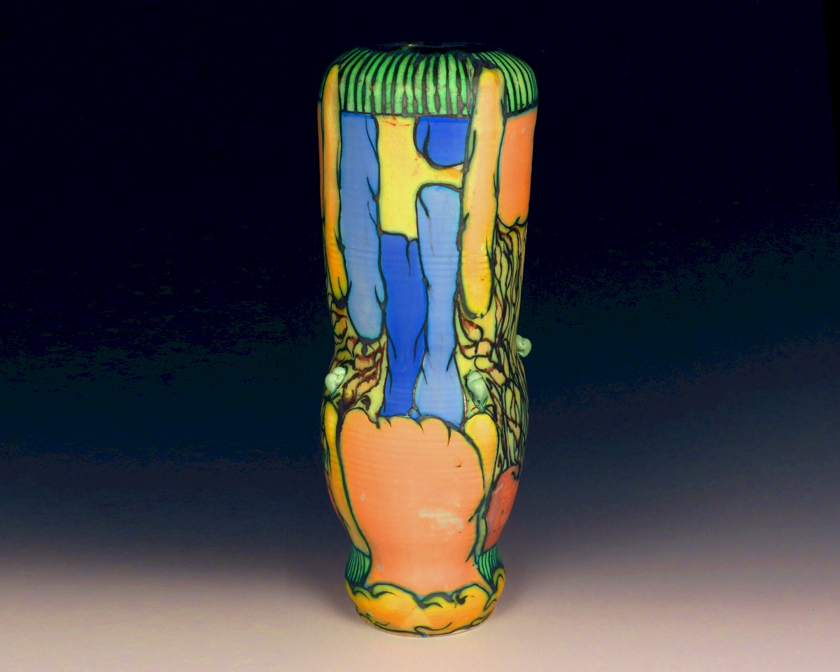
"We know the sky's blueness even before we know it as "blue", let alone as "sky." - Robert Irwin
Artists use their own understanding of color to tell a story, bend emotions, or describe a sensation. The day Colin painted this picture, it was a beautiful and bright, the sun high above. The true color of the sky was light with sun, the barn's red washed out in its gleam. Colin intentionally chose to darken the sky to a pure blue and saturate the red to recreate the sensation of the day. Likewise, George Pearlman is making careful color choices. George has spent years experimenting with color glazes to get the shades you see in his pottery. The blues and the oranges are the hues he has been exacting, the black also intentionally chosen for its copper content, which gives green glow as it interacts with other glazes. Together, the colors create a spring symphony, a joyful vessel to brighten our moods after a long winter.